


CECIL'S KITCHEN LOGO DESIGN
Cecil's Kitchen Wall Graphic & Logo Design
Client:
Staverton Nursery
Year:
2024
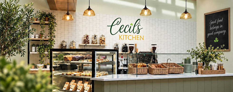
A new identity was developed for Cecil’s Kitchen, the restaurant area within Staverton Nurseries, creating a distinctive brand that could sit confidently behind the counter while still feeling very much part of the wider Staverton family.
The logo takes its visual cues directly from the existing Staverton Nurseries identity, carrying through the established deep green and warm golden yellow colour palette alongside the small botanical motif. This creates an immediate visual relationship between the two brands and ensures Cecil’s Kitchen feels like a natural extension of the nursery rather than a completely separate business.
To give the restaurant and 'grab & go' its own character, a more relaxed, handwritten typeface was introduced for Cecil’s, paired with an elegant serif for Kitchen. The combination brings a warmer and more informal personality to the identity, reflecting the welcoming, homemade feel of a café environment while retaining the refined qualities of the parent brand.
Colour variations were also developed to give the logo flexibility across different applications and backgrounds, including signage. The finished identity balances recognition and individuality — clearly connected to Staverton Nurseries, but with enough personality to establish Cecil’s Kitchen as a destination in its own right.


